FIGBUILD 2026 / PRODUCT DESIGN
Prosody
A visual language for the things we hear between the words.
Explore the pitch deck ↗
01 / PROBLEM
I want to understand people better.
A text, a subtle statement, or a shift in body language can leave us wondering whether we have misunderstood someone. Prosody began with the difficulty of interpreting social cues—and understanding how our own tone is perceived.
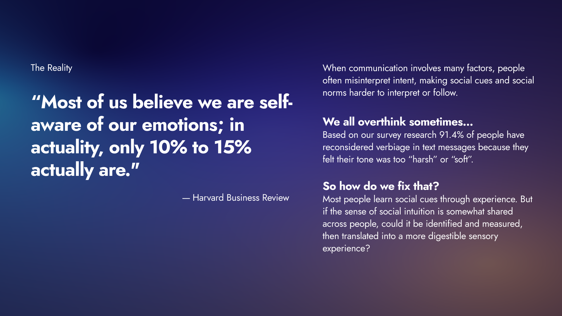
Our survey found that 57.1% of respondents often felt misinterpreted, while 91.4% reconsidered their wording because of tone. These findings motivated the concept; they are not measures of the product’s effectiveness.
Framing the communication challenge
The original pitch slide connects survey findings to the idea of translating social cues into another sensory experience.
02 / IDEATION
Listen in color.
We explored synesthesia and cross-sensory associations as inspiration for translating emotional signals in speech into shapes and colors.
Interviews and research reinforced that tone is context-dependent. Culture, personal experience, and ambiguity matter, so a single fixed visual dictionary would not work for everyone.
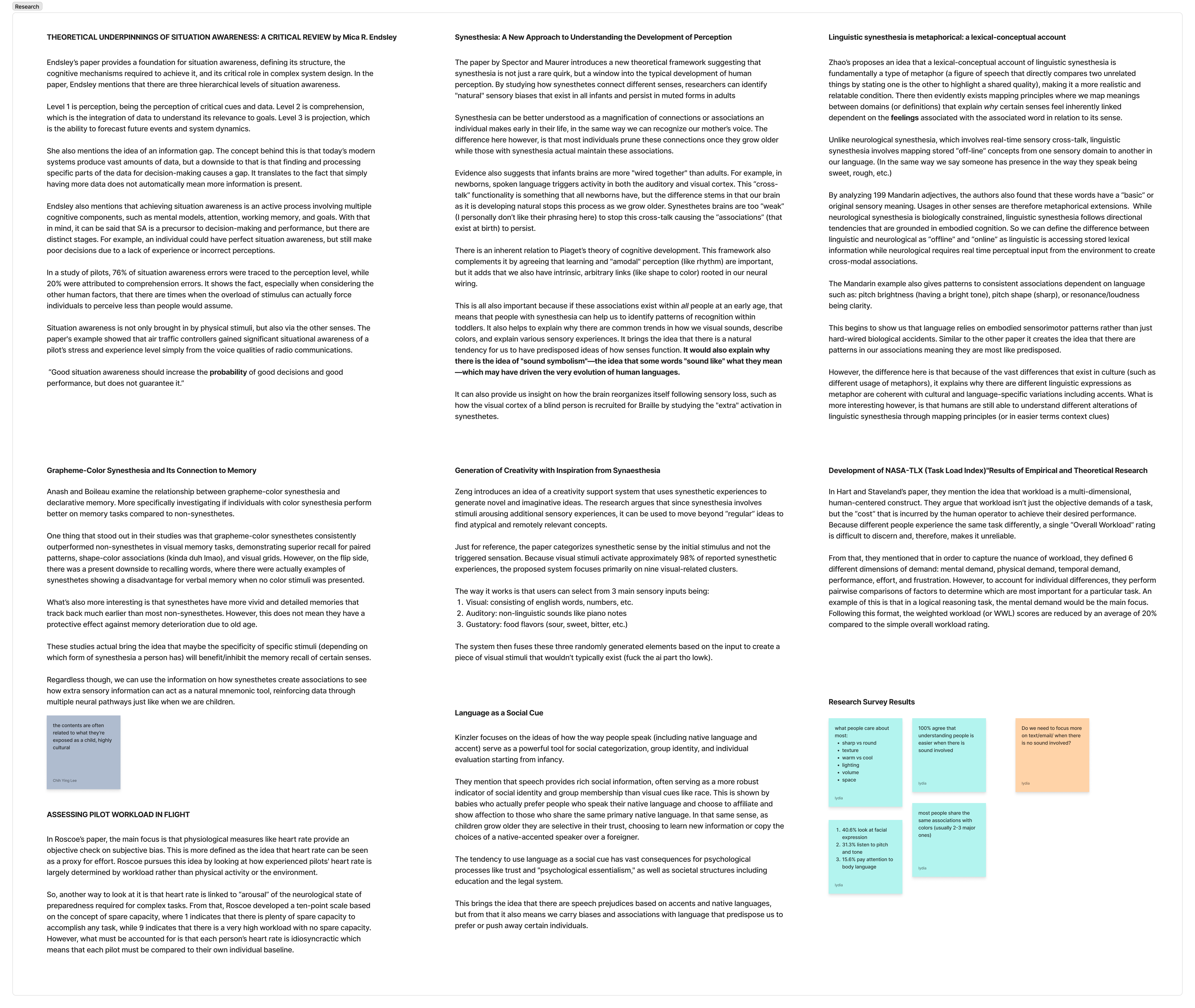
Research behind the visual language
Working notes explore situation awareness, synesthesia, language, workload, and survey observations. These are exploratory notes rather than validation of the product concept.
03 / IMPLEMENTATION
Personal meaning, not a universal code.
The concept uses a short onboarding quiz to calibrate personal associations between visual forms and emotion. Pitch variation, loudness, rhythm, and tone quality inform the proposed visual feedback.
We considered silence, new speakers, and potentially harmful language as edge cases. The intended experience helps people reflect on communication without treating an emotional interpretation as an objective fact.
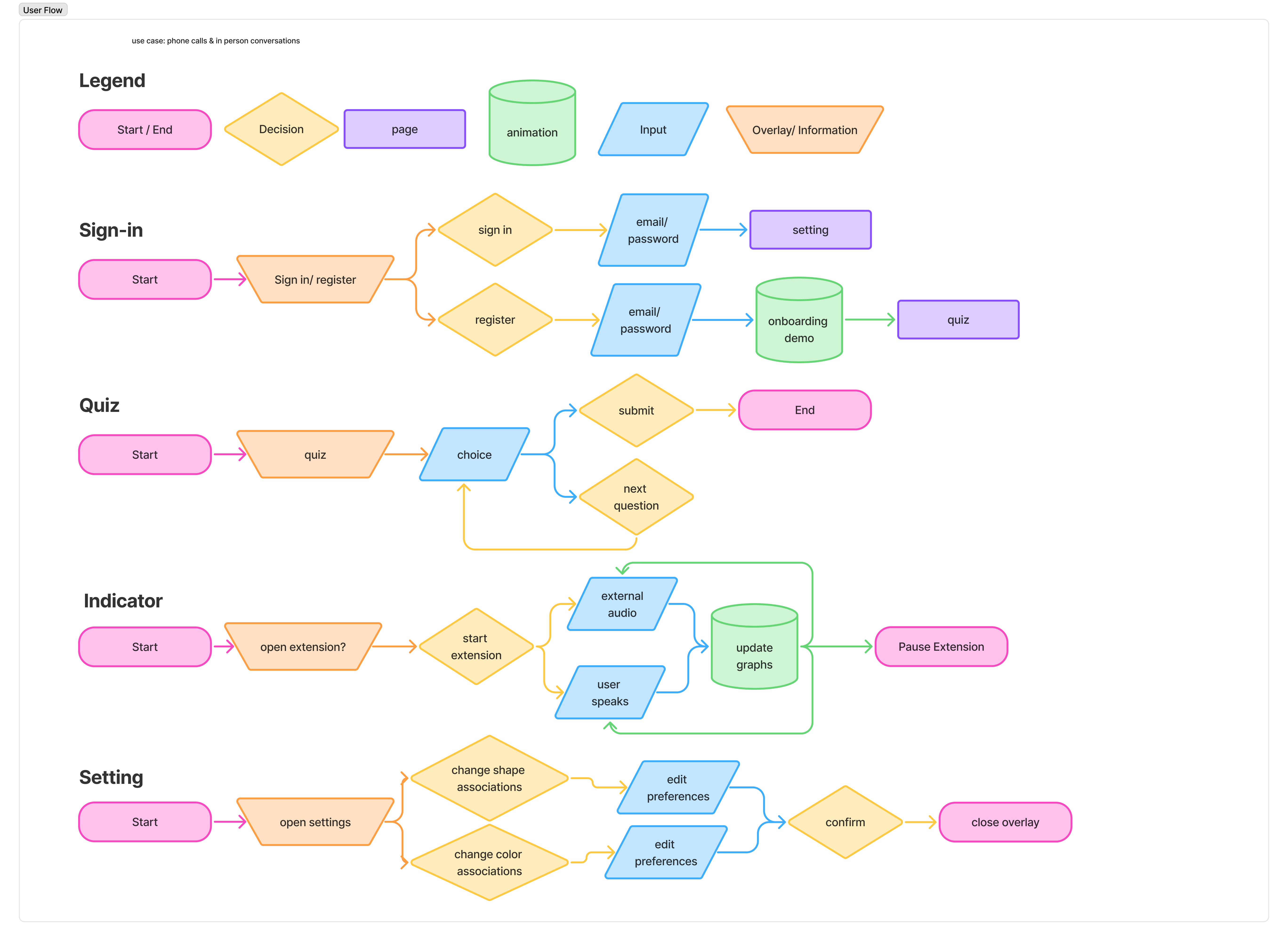
From onboarding to live feedback
The flow maps registration, a calibration quiz, audio-driven indicators, and settings for changing shape and color associations.
04 / OUTCOME
A concept made tangible.
We assembled a pitch deck with the central user story, prototypes, and AI-iterated examples, including the edge cases that shaped the design.
The result is a product-design proposal for more intentional communication—not a claim of a deployed or clinically validated emotion-recognition system.
See the visual experience.
A screen recording of the project’s proposed experience in motion.