01 / FISERV / UX RESEARCH & DESIGN
Making data
connect.
A dashboard for people with minutes to spare—and complex decisions to make.
- CONTEXT
- Fiserv internship
- MY FOCUS
- Research & dashboard redesign
- DESIGNED FOR
- Executive exploration
01 / THE PROBLEM
Depth without
the overload.
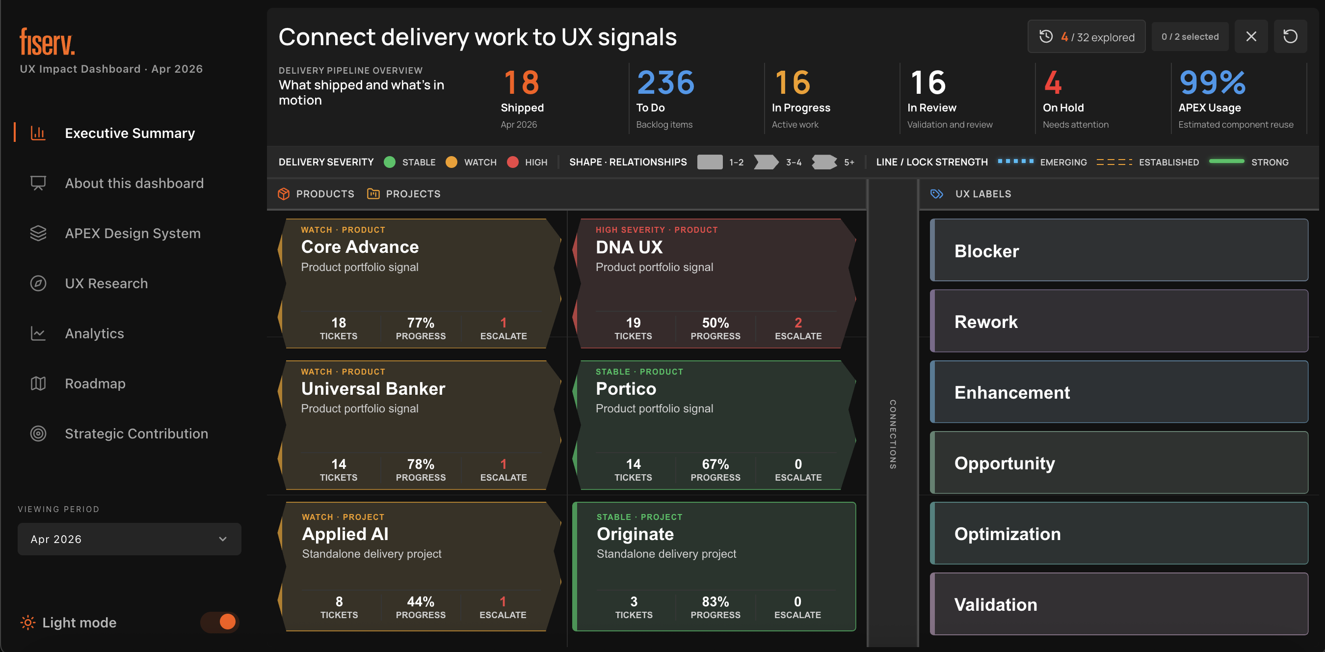
During my internship at Fiserv, I was tasked with redesigning a UX research dashboard for executives—a user group with very little time to spare.
The challenge was to help someone digest complex, multi-project data in 1–3 minutes without stripping away the depth they might need.
How do we make information understandable at a glance, while giving users control over their own path through the data?
The 1–3 minute window was a design goal, not a measured usability result.
02 / IDEATION
Make the abstract
feel graspable.
I found unexpected inspiration in a familiar phrase: “Explain it to me like I’m 5.” Not because executives need childish simplification, but because children’s toys teach complex concepts through intuitive, hands-on interaction.
I explored research papers on children’s toy design and interaction design, looking for principles that could translate into a data experience. Physical, puzzle-like interactions offered a way to make abstract relationships easier to understand.
Let people connect information—not just read it.
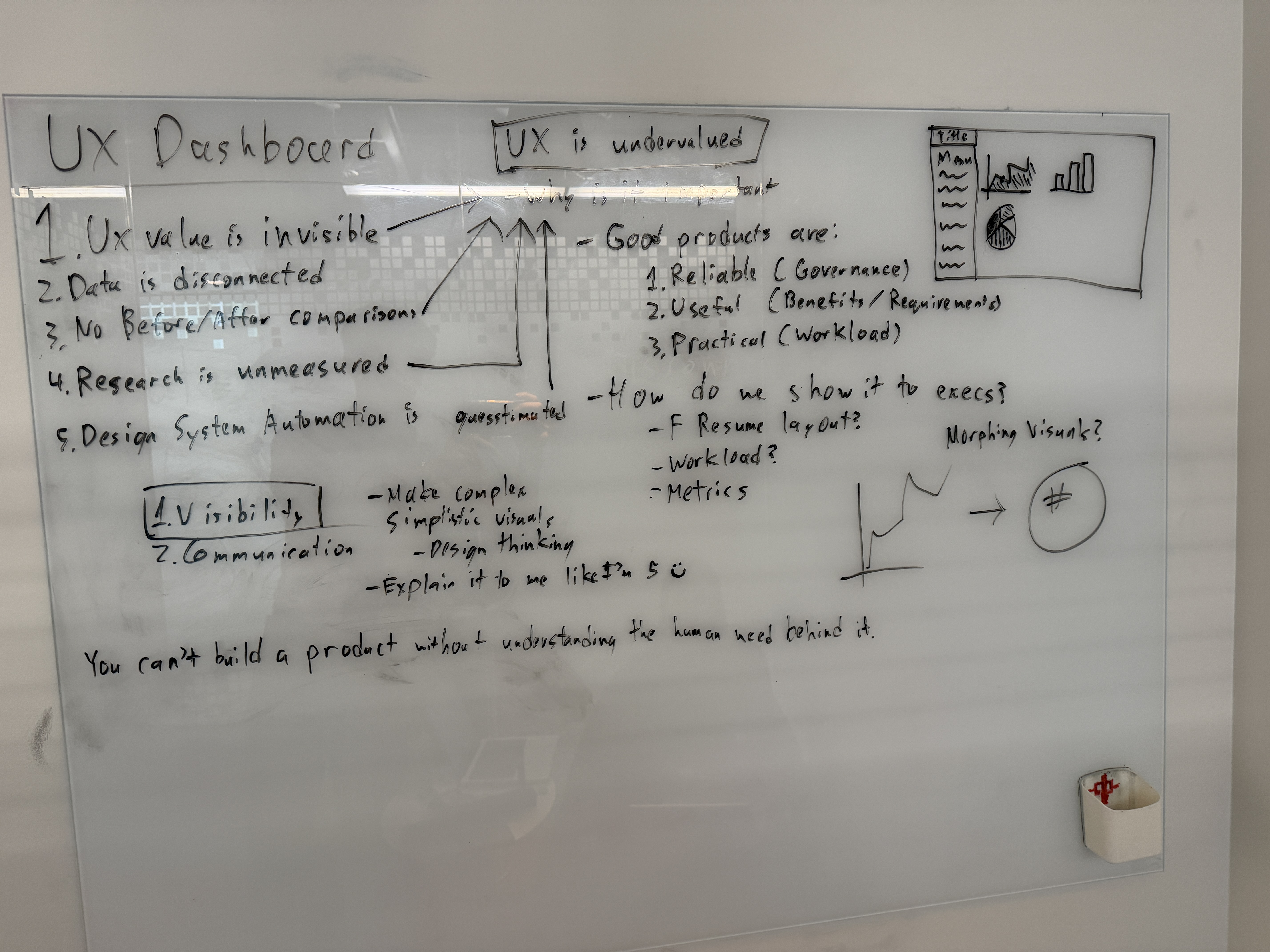
Early working questions centered on making UX value visible and connecting fragmented data. The board captures the “explain it to me like I’m 5” direction alongside initial dashboard and visual-transformation sketches.
03 / IMPLEMENTATION
From data cards
to connections.
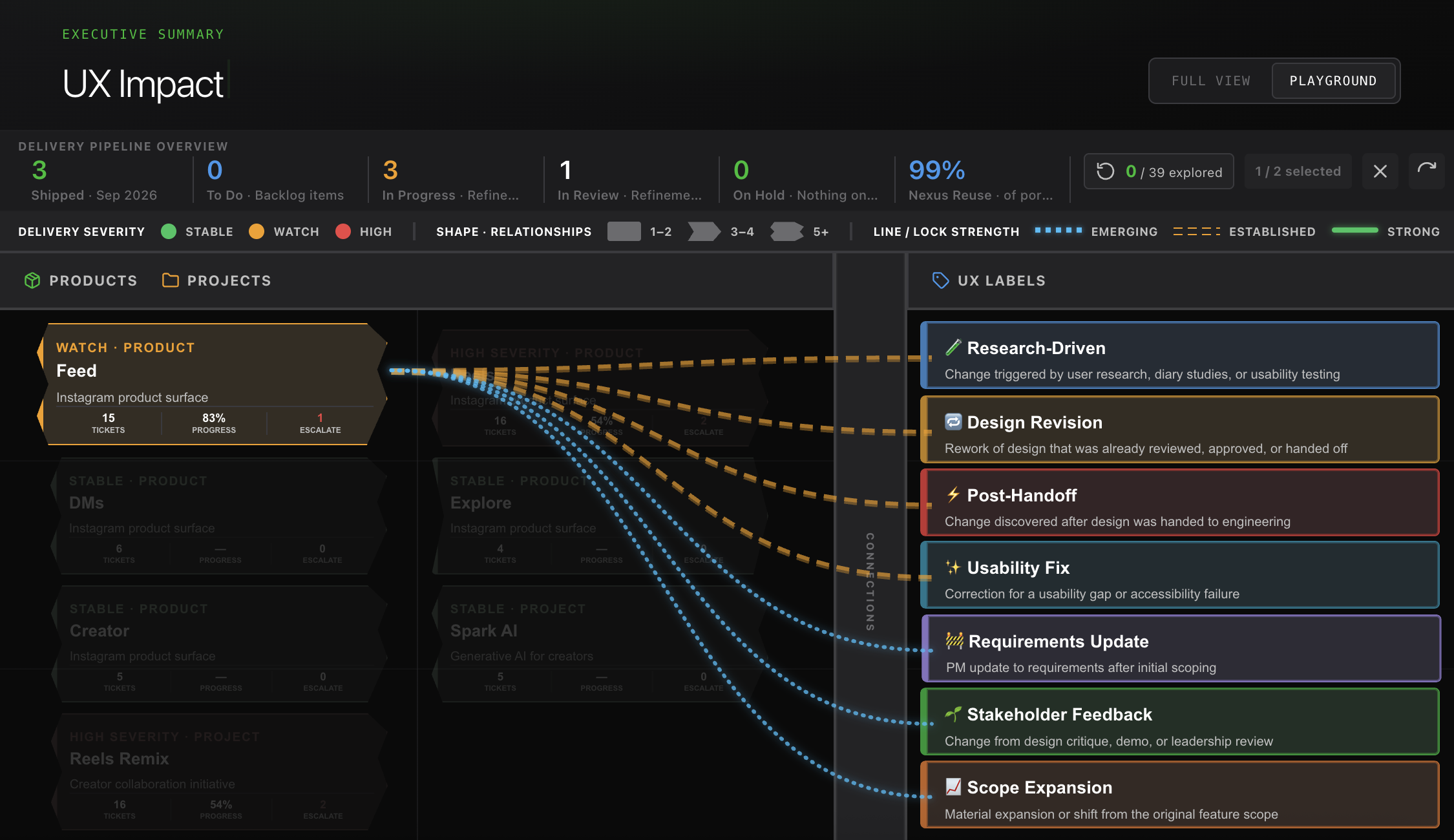
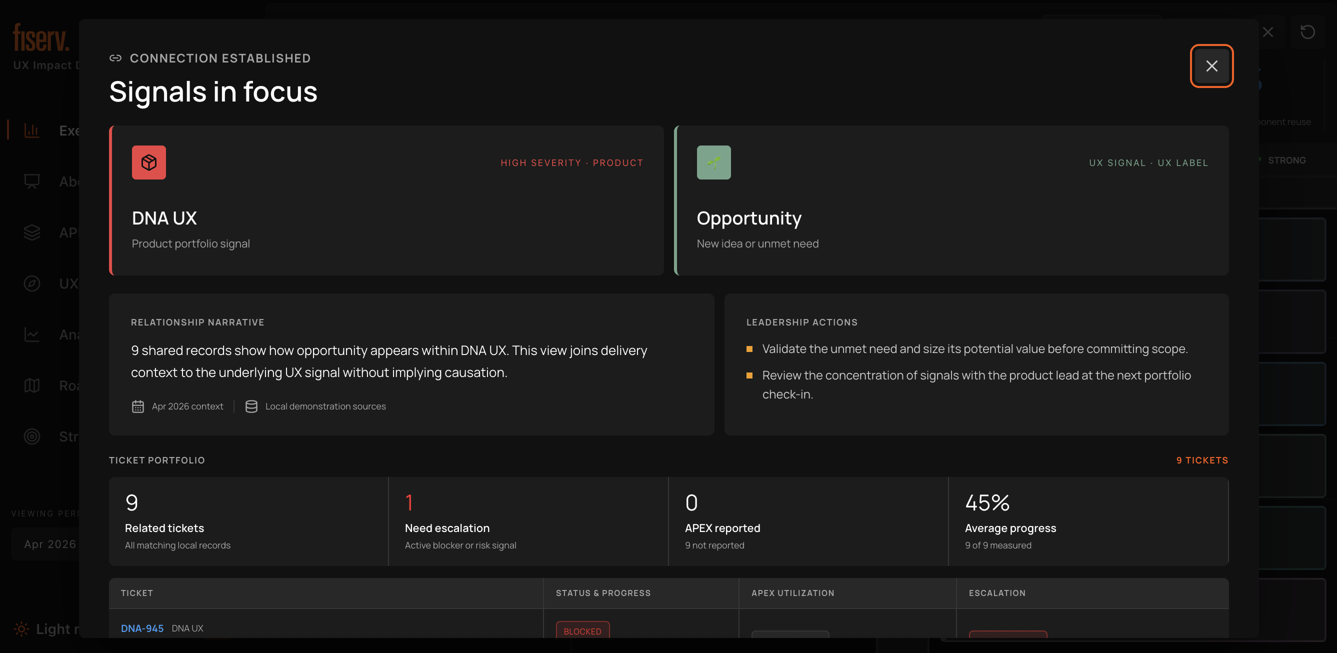
The core concept became data cards designed like puzzle pieces on a sandbox interface. Connecting related cards opens a window summarizing the relationship between those data points.
This gave executives the freedom to explore what mattered to them while retaining a high-level view of project and product performance.
- 01 / SCAN
Start with the overview.
Read delivery metrics and identify the product or project that needs attention.
- 02 / CONNECT
Bring signals together.
Connect related cards to explore how delivery work relates to a UX signal.
- 03 / EXPLORE
Follow the relationship.
Open a focused summary with context, leadership actions and supporting records.
04 / OUTCOME
One overview.
Multiple paths.
The final product was a single-screen dashboard overview, with connection-driven detail views that made complex relationships legible at a glance.
Still in use by executives at Fiserv today.
Rather than forcing every user through the same sequence, the dashboard lets them choose where to go deeper.